Global nav & right toolbar
This doc describes the top bar and vertical toolbar on the right of the canvas: what each control does and where to find it.
Top bar (top-right)
The top bar sits at the very top of the page, aligned right. It does not include the left-side Logo (the Logo is in the parameter panel header).
Top bar buttons (left to right)
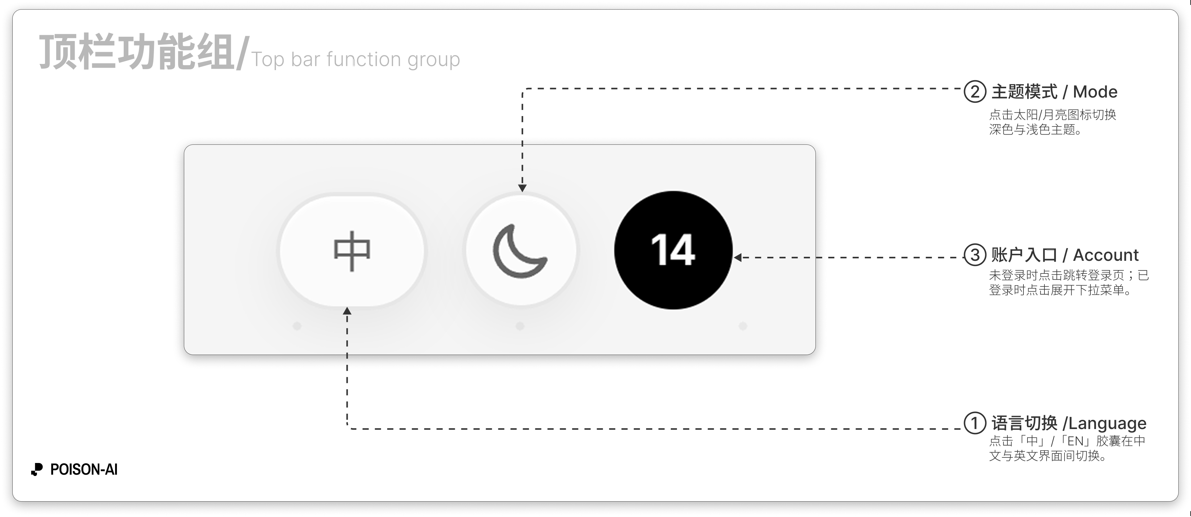
Language
- Shown as a pill button: 「中」 or 「EN」.
- Click to switch between Chinese and English; hover shows “Switch to Chinese” or “Switch to English”.
Theme
- Round button: sun icon when in dark theme (switch to light), moon icon when in light theme (switch to dark).
- Hover: “Switch to light mode” / “Switch to dark mode” (or equivalent in the current UI language).
User avatar / sign-in
- Signed out: Purple “user” icon; click goes to login/signup.
- Signed in: Your avatar or email initial; click opens the dropdown menu.
User dropdown (when signed in)
From top to bottom:
Header (non-clickable)
- Total credits (subscription + top-up) plus progress bar and expiry.
- Plan badge (top-right): Free / Starter / Pro / Ultimate, or “Unsubscribed” if expired; shows billing cycle (yearly/monthly) when applicable.
Upgrade plan or Change plan (Star icon)
Opens the subscription and pricing page; if the subscription is expired, this opens and stays open until you renew or downgrade.Credit usage (Receipt icon)
Opens the credit usage modal to see each charge and type.Contact support (LifeBuoy icon)
Opens the support modal with contact and email.Divider
Sign out (LogOut icon)
Signs you out.Delete account (Trash2 icon, red/danger)
Permanently deletes the account; a confirmation dialog appears after click.Footer
Shows your avatar and signed-in email.
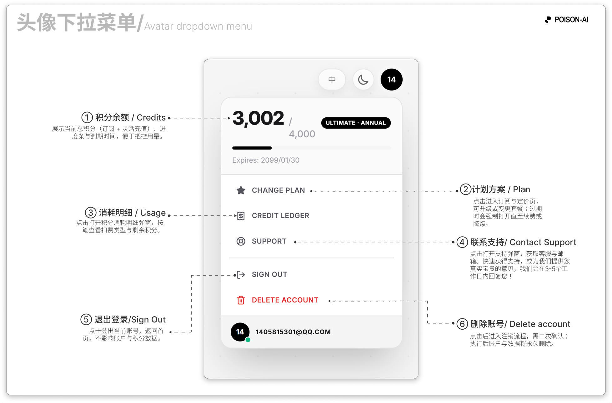
- ① Credits — Total credits (subscription + top-up), progress bar, and expiry.
- ② Plan — Opens subscription and pricing; upgrade or change plan; if expired, the page stays open until you renew or downgrade.
- ③ Usage — Opens the credit usage modal to see charges and remaining balance.
- ④ Support — Opens the support modal for contact and email.
- ⑤ Sign out — Signs you out; does not affect account or credits.
- ⑥ Delete account — Starts account deletion; requires confirmation; account and data are permanently removed.
If the product adds or removes menu items, follow the in-app UI.
Canvas right toolbar
The right toolbar is a vertical strip along the right edge of the canvas (glassmorphism style). From top to bottom:
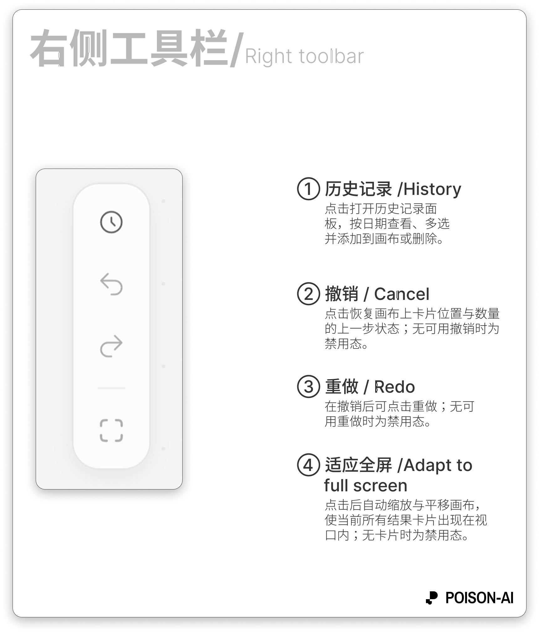
History
- History/clock icon.
- Opens the history panel to view current session and recent image/video results, grouped by date; view single item, multi-select, add to canvas, or delete.
Undo
- Counterclockwise arrow icon.
- Restores the previous card positions and count on the canvas; disabled when there is nothing to undo.
Redo
- Clockwise arrow icon.
- Redoes after an undo; disabled when there is nothing to redo.
Divider (visual only)
Fit to screen
- Fit/fullscreen-style icon.
- Zooms and pans the canvas so all current result cards fit in the viewport; disabled when there are no cards.
Summary
- Top bar: Language (中/EN), theme (light/dark), user avatar (signed out → login; signed in → credits/plan/usage/support/sign out/delete account).
- Right toolbar: History, Undo, Redo, Fit to screen; all apply to result cards on the canvas and the history panel, separate from the left parameter panel.